Editing Queries for Panels in Application Dashboard
Before you begin
In order to edit the queries, you must first have a data source connected and a configured dashboard.
Dashboard Structure
For visualization of the metrics, you need to tune the queries as per your use case. To learn about the dashboard schema click here. The hierarchical structure of the dashboard is defined as follows:
Dashboard (root)
+--Panel Group
    +-- Panel
        +-- Graphs
The dashboard is the root level element that contains multiple panel groups. A panel group is a collection of similar types of panels. For example, panels that reflect the data about pod CPU usage should be grouped under the same panel group. A panel is a collection of similar types of graphs. For example, if multiple graphs are primarily based on the HTTP metric like http_request_count_seconds and http_request_duration_seconds_sum then they can be placed under the same panel.
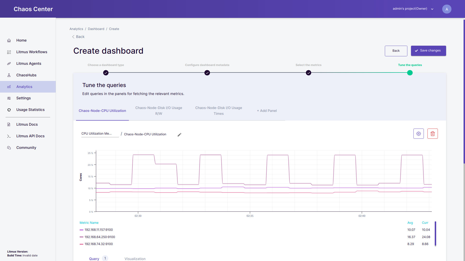 Create dashboard, Tune the queries step
Editing Queries
Add a panel: Every individual tab in the
Tune the queriesheader section corresponds to a panel. For example in the image given belowChaos-Pod-CPU UsageandChaos-Pod-Memory Usageboth are individual panels. To add another panel simply click on+ Add Paneland a new panel will appear with the nameUntitled Panel.By default, the newly added panel is placed in the
Untitled Group name. You can select a panel group from the list of the existing panel groups or add a new panel group by clicking onUntitled Group name, entering a new name, adding it to the list by hitting enter and then selecting it from the list of all panel groups. For example, in the image below we have added a new panel groupHTTP Panel Group.To edit the panel name click on
Untitled Paneland rename it to any desired name of your choice. For example in the image below a panel namedHttp requestshas been added.
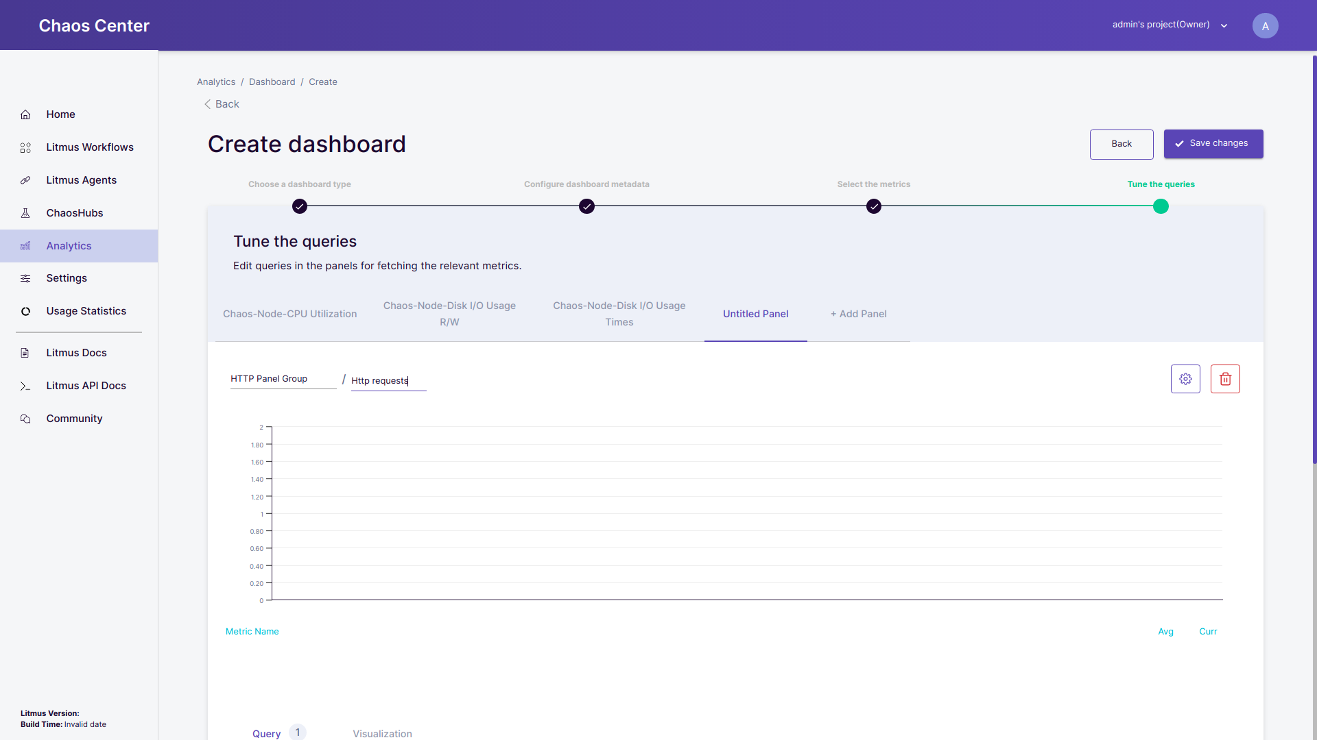 Adding a panel
Delete a panel: Click to delete the current panel
Configure panel: Click to open/close the configuration dropdown for the current panel
Add a query: To add a query in the panel, click on
Add Querybutton. A new query will be created with some prefilled configurations.
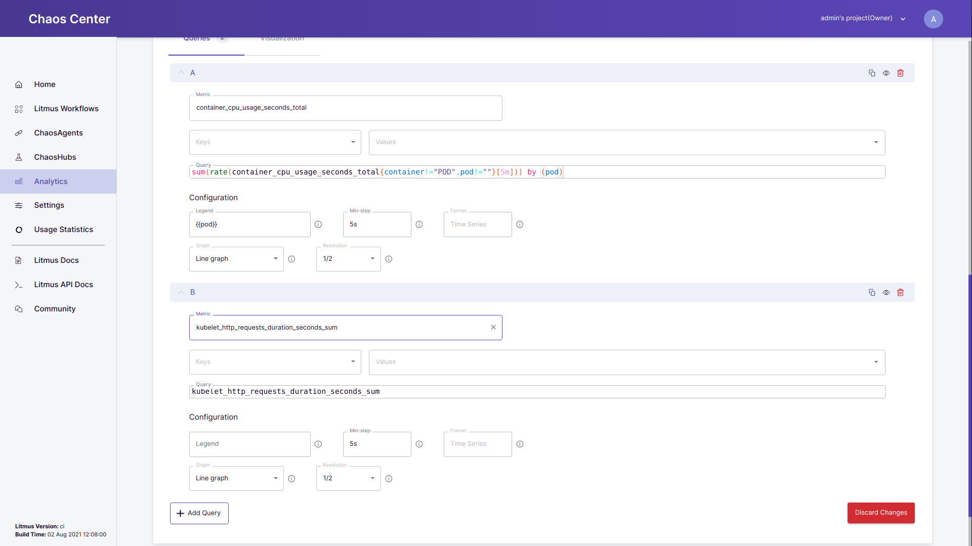 Editing a query
Copy query: Click to copy the query.
Delete a query: Click to delete the specific query.
Hide query: Click to hide the query from the panel. This feature assists you in creating and tuning the graph without deleting the queries.
Queries: you can edit the queries to get the appropriate visualisations of your application’s metrics. The number of queries present in the particular panel is also mentioned besides the
Queriestext. Please note that the metric, key and values fields provide you assistance in the generation of a query. You may generate a query with their assistance or if you already have a query then you can directly add it in the query field.Metric: All the metrics which are valid as per the connected data source are listed in the dropdown. Select any metric as per your requirement. Also if you want to input a metric that is not listed in the dropdown then you may simply enter the metric name as the option of free-solo has been enabled.
(Optional) Key & Values: Based upon your selection of the metric, all the valid keys are listed in the dropdown. For a given key all the possible valid values are listed in the drop-down list in the Values field. You may select multiple values for the given key.
To select and configure multiple keys, you can switch between all the keys available and select the corresponding values for them. All of your selections for the keys and their values are reflected in the query generated based upon your selection.
Query: This field can be auto-generated based upon your selections for the metric, key and values field or you can directly provide it with a query. The query editing option also comes along with intelligence for user assistance.
Configurations :
- (Optional) Legends: The legend field is used for grouping the metric data
- Min-step: The time interval between the two data points are the given metric. By default, it is
5 seconds. The lower the min-step the denser the graph is. - Format: The format for the given metric. By default, it is
Time Series. - Graph: Select the type of graph with which you want to visualize the graph. By default, it is a
Line graph. - Resolution: To smoothen the rendering process for metrics with a huge amount of data, a resolution option is provided. Resolution determines the ratio of data points to be shown out of all the data points fetched by the given metric. This feature is under development and will be fully functional in the upcoming version.
Visualizations: It enables the user to customize the visual experience on the dashboard.
- Points: By default points option is turned off. If switched on, it will plot a point marker for the individual data points of the metric.
- Grids: By default, the grid option is turned on. It is meant to render a grid line in the background of the graph which aids the viewers of the graph to perceive and evaluate the unlabeled data points of the metrics.
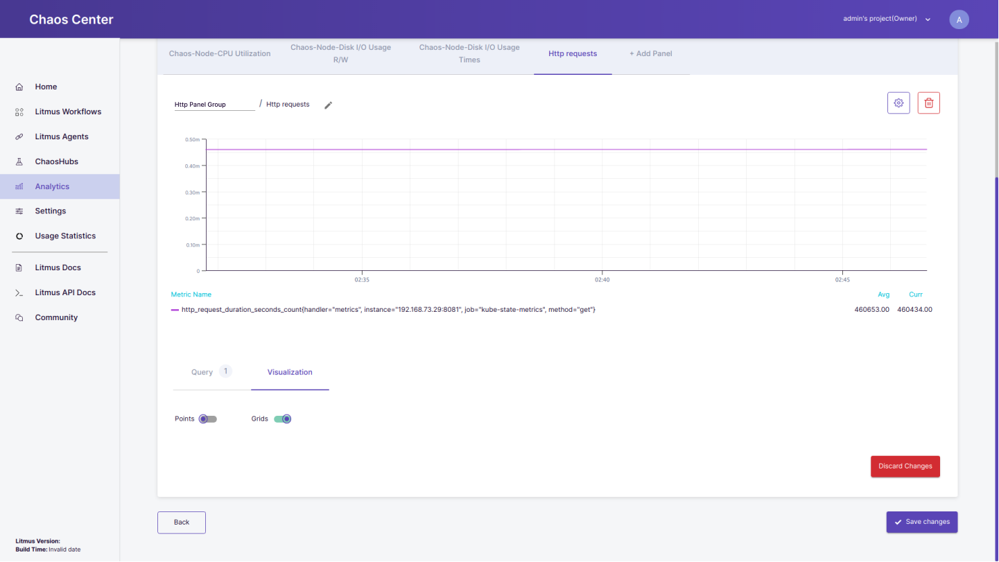 Visualization options
Discard changes: By clicking this button it reverts all the changes performed in the given panel.
Save changes: Click this button to save all the changes made in the dashboard.